I believe a mock-up, a model of the proposed piece, is an essential step in designing original woodwork. It should be full size if at all practical.
The mock-up allows the designer to sense spatial relationships and proportions from various viewing angles, as well as the overall physical impact of the piece with a veracity that cannot be duplicated with a paper drawing or even with a manipulable 3-D CAD creation. Such images cannot give you a real sense of how the size of a chair relates to your body, how a table fills space in a room, how intimate a small wall cabinet might feel, or how a curve flows in a table leg.
Perhaps until we have consumer technology to project a full size hologram in front of us, mock-ups are a must. Make them expediently from wood scraps, cardboard, plywood, tape, biscuits, foamcore, hot-melt glue, and so forth. Use a bandsaw, rasp, drawknife, scissors, marking pens, or whatever else is quick and easy. It should feel like playtime. Make just what you need to put the concept of the piece in front of you so that you can work with it.
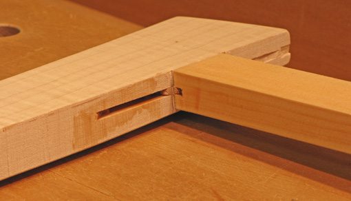
Experience the proposed piece as you might approach it in a room. Sense how elements and sections relate to each other and to the whole. You may be pleased or unsettled, so change what you wish, guided by your vision of the concept of the piece. For some woodworkers and some pieces, it might be possible to do minimal drawing and work can proceed almost entirely from mock-ups.
It is often helpful to mock up critical elements of a piece with more precision, for example, a table leg or door handle. Perhaps compare two slightly different legs, one at each side of a mock table top, and glance right and left to see which one you like better. Some elements can be expedited. Drawer fronts might be drawn on a plywood sheet. Sometimes a partial mock-up containing the key elements is all that is necessary.
I find the Goldilocks method helps solve a lot of problems. For example, how much should a table top overhang an apron? I’ll adjust mock-up sections of a top and apron: too much for sure, too little for sure, then work within that range and somewhere . . . it feels just right. Unlike Goldilocks, I routinely revisit the mock-up later in the day or on another day to see if it still feels right.
What you think and feel is right and supports your concept of the piece, IS right. That’s the point! Trust yourself.
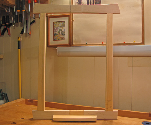
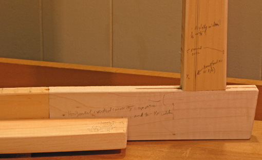
For the mirror, the example piece in this series, I bandsawed scraps, worked with rasps and an oscillating sander to get the curves about right, and joined the pieces with biscuits and screws. As you can see, I changed things by elongating biscuit slots and by splicing in center sections. I drew lines to represent beading of which I had also cut a sample section. I scribbled notes on the mock-up. I experimented with keeping or losing the shelf and with a contrasting circular piece in the top center of the frame.
Next in the series: Drawings

