Here are examples to illustrate the value of considering the finish in the design stage of a project, as discussed in an earlier post.
[Note: The appearance of these samples is influenced by many factors including the lighting on the objects when I photographed them, the properties of my camera, image processing for presenting on the internet, your monitor, your eyes, and your brain’s visual processing. I tried to adjust the images, including the colors’ hue, saturation, and brightness, to make them look to me, on my monitor, as close as possible to how the actual pieces look to me in the room.]
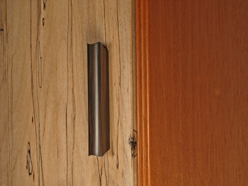
In the piece pictured above, I wanted to keep the spalted maple close to its unfinished appearance so I used water base poly-acrylic. Oil would have darkened and blotched the light color and ruined the contrast of the black-line spalting. The mahogany has a padded blonde shellac finish (applied to most areas before assembly) with wax over it. The plain mahogany sets off the spalted maple and has its own delicate sheen which also enhances the play of light on the beading. Water base would have made it look lifeless. The Macassar ebony handle gets an accented sheen from wiping varnish and coordinates with the black spalt lines. No single finish would have done justice to this group of woods. This has to be tested and worked out early in the project.
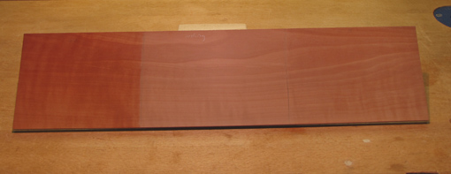
When finishing, I want to keep, not kill, the good qualities the wood already has. Pear has a dignified, almost precious aura. The sample of unusually dense German pear below, unfinished in the center section, looks greasy and artificial to my eye when oiled as on the left side. The water base finish on the right is just enough to bring out the curl and protect the wood without overwhelming it. No finish might look best but, practically, dirt and grime might eventually detract from the appearance of handled parts.

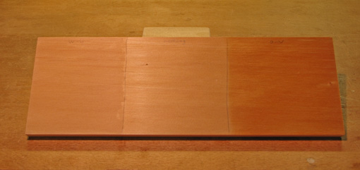
Port Orford cedar, especially when quartersawn, has a meditative, simple beauty that is difficult to capture in a photograph. When planning this species into a project, consider not only it appearance but its pleasant, spicy aroma. For panels in the interior back of a cabinet, for example, it is best left alone after it is smoothed with a hand plane. For parts that will receive wear, the thin water base poly-acrylic on the left is barely different in color from the unfinished middle section. The oil-varnish on the right section is brutal – looks like it came out of a 1950s barber shop.

In all of this, opinions will vary. The main thing is to decide what you are trying to achieve in a project and make the finish part of that as you design, not an anxiety-provoking puzzle to consider after the piece is built when, teetering on disappointment, you might finish yourself into a corner.
In an upcoming post, I’ll present more samples including: pop the figure but not too much, less can be more, and consider the long term.


Good post, Rob. In your experience, what is the advantage, or is there, with the poly-acrylic on the cedar over a clear shellac?
Thanks
I read your explanation about color adjustments, but could I ask what kind of monitor you have? Your images look extremely red/orange on all my LCD monitors. When I take them into Paint.net and do an “Auto-level”, the colors change so dramatically that I’m not sure I’m looking at anything even close to what you intend.
How would you describe the color of the handle in your first picture? Patina’d bronze or metallic dark blue/black?
Here’s a link to Paint.net (it’s free) if you’re interested.
http://www.getpaint.net/
Actually, I have an idea for calibrating the color shots. If you include a neutral color grey in every shot, then it would be simple for anyone viewing your pictures to rebalance the images themselves with a simple photo editing tool like paint.net. They even make grey cards specifically for that purpose. Here’s an example.
http://www.amazon.com/dp/B001G04VJO/ref=sr_1_1?qid=1264533488
Just a thought…
Good day. realy nice and informative post! Would it be possible to include some brand name with your product description, like the water based poly-acrylic you mension above?
Thank you.
David
Tico,
I found Zinsser Sealcoat (blonde, dewaxed) cut to about a one-pound cut from its original two-pound, gave more added color than I want. Maybe a true bleached shellac would work well, but I haven’t tried that.
David H.,
I think that if put a reference neutral gray in the photos, a viewer would have to have a physical copy of that color with which to adjust his monitor to presumably make the other colors show as intended. But…I’m not sure about that.
In any case, the handle is black/extremely dark brown with medium brown stripes. The unfinished pear is a dark salmon. The unfinished P.O. cedar is a slightly yellowish straw color. I hope this helps.
David G.
Sure. Please see the earlier post:
http://www.rpwoodwork.com/blog/2010/01/17/my-starting-lineup-of-finishes/
And please note the succeeding post about Bartley’s.
Thanks for reading.
Rob
Rob,
No, a viewer wouldn’t have to have a physical copy of the card. Many photo editing programs allow you to point to a specific area in a photo to tell the program that that area is a neutral color — in other words, equal intensity of red, green, and blue (or cyan, magenta, and yellow, depending on the color model). By making the three color components equal for that area, the program is able to do the best possible job making the other colors in the photo as close as possible to the original.
Any grey area in a picture can serve that purpose. The standard 18% grey cards are just a convenient way to achieve that.
David